Data series are represented by names in the legend and appear as like-colored groups of data markers on your chart. One point from each data series makes up a category. Categories, then, are groups of data points with similar characteristics. The values for categories and data series can come from either the rows or columns of your data.
For example, suppose your data looks like this:

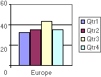
If you want to compare unit sales in Europe categorized by quarters, your series would be in columns and your categories in rows, and the chart would look like this:
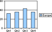
If you specify that your series are in rows, instead, the chart would use Europe as the category, and each quarter would make up a series, like this: