WAAPI Widgets
WAAPI UMG Widgets
Ak Check Box
This WAAPI-enabled check box allows you to control a boolean property in Wwise.

Properties:
- Property to control: Name of the boolean property to control in Wwise.
- Item to control: Item to control in Wwise.
- On Check State Changed: Event called when the check box's state changes.
- On Item Dropped: Event called when an item is dropped on the check box.
- On Property Dropped: Event called when a property name is dropped on the check box.
Blueprint methods:
- IsPressed: Returns true if this button is currently pressed.
- IsChecked: Returns true if the check box is currently checked.
- GetCheckedState: Returns the full current checked state.
- SetIsChecked: Sets the checked state.
- SetCheckedState(ECheckBoxState InCheckedState): Sets the checked state.
- SetAkItemId: Sets the item ID this check box controls.
- GetAkItemId: Returns the ID of the currently controlled item.
- SetAkBoolProperty: Sets the property name this check box controls.
- GetAkProperty: Returns the current item property.
Ak Item Bool Properties
Pre-made picker for Bool properties. Useful for drag & drop use with Ak Check Box or Ak Slider.
Ak Item Properties
Pre-made picker for float properties. Useful for drag & drop use with Ak Check Box or Ak Slider.
Ak Slider
This WAAPI-enabled slider is able to control any float property in Wwise. When the controlled property is changed, the range for the slider's values will automatically be adjusted to the same range as in Wwise.

Properties:
- Property to control: Name of the boolean property to control in Wwise
- Item to control: Item to control in Wwise
- Value: The slider's value
- On Value Changed: Event called when the slider's value changes
- On Item Dropped: Event called when an item is dropped on the slider
- On Property Dropped: Event called when a property name is dropped on the slider
Blueprint methods:
- GetValue: Returns the current value.
- SetValue: Sets the current value.
- SetCheckedState(ECheckBoxState InCheckedState): Sets the checked state.
- SetAkSliderItemId: Sets the item ID this slider controls.
- GetAkSliderItemId: Returns the ID of the item currently controlled.
- SetAkSliderItemProperty: Sets the property name this slider controls.
- GetAkSliderItemProperty: Returns the property name this slider controls.
Ak Wwise Tree
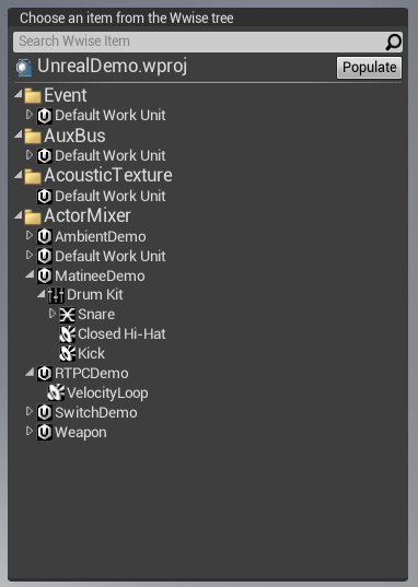
This widget is an exact copy of The WAAPI Picker, available in-game. It allows to assign items to Ak Check Box and Ak Slider via drag & drop.

Properties:
- On Selection Changed: Event called when the tree's current selection changes.
- On Item Dragged: Event called when an item is dragged from the tree.
Blueprint methods:
- GetSelectedItem: Returns the item currently selected in the tree.
- GetSearchText: Returns the current text in the search box.
- SetSearchText: Sets the current text of the search box.
Ak Wwise Tree Selector
More compact version of the Ak Wwise Tree, which pops a separate window to select the item.

Properties:
- On Selection Changed: Event called when the tree's current selection changes.
- On Item Dragged: Event called when an item is dragged from the tree.
Slate Widgets
FWwiseTreeItem
Structure containing everything needed to represent a Wwise item.
Members:
- DisplayName: The item's name
- FolderPath: The path of the tree item in Wwise, including the name
- ItemType: The type of item
- ItemId: The ID of the item
FWwisePropertyDragDropOp
Handles drag & drop of a property name. Simply pass the property name to FWwisePropertyDragDropOp::New to create the drag & drop operation.
FWwiseUmgDragDropOp
Handles drag & drop of a Wwise item. Simply pass a shared pointer to a FWwiseTreeItem to FWwisePropertyDragDropOp::New, in order to create the drag & drop operation.
Ak Slider
This WAAPI-enabled slider is able to control any float property in Wwise. Is able to handle drag & drop via FWwisePropertyDragDropOp and FWwiseUmgDragDropOp.
Public methods:
GetAkSliderValue: Gets the current value of the slider, as displayed in the Wwise Authoring application.GetAkSliderProperty: Gets the name of the controlled property.GetAkSliderItemControlled: Gets the name of the item being controlled by the slider.SetAkSliderItemProperty: Sets the property to be controlled by the slider.SetAkSliderItemId: Sets the ID of the item to be controlled (GUID string, using the "Digits with Hyphens in Braces" GUID format).SetAkSliderRangeMin: Sets the slider's minimum value.SetAkSliderRangeMax: Sets the slider's maximum value.GetAkSliderRangeMin: Gets the slider's minimum value.GetAkSliderRangeMax: Gets the slider's maximum value.
Generated by
 1.6.3
1.6.3