Differential Display of Beacon Qualities for Each Access Point
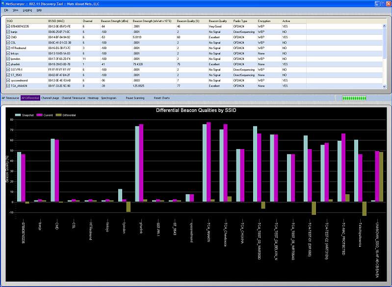
This chart displays the current beacon strength of each access point compared with an earlier snapshot. The current beacon strength is displayed in purple, the snapshot in light-blue, and the difference in olive green. The Y-axis reports the signal strength as a signal quality (0 - 100%) -- where a maximum signal is assumed to be -20 dBm and the dissociation signal is -85 dBm (http://www.ces.clemson.edu/linux/dbm-rssi.shtml). We find this more intuitive than reporting a RSSI in dBm or mWatt. If you would also like to know the signal strength in dBm then this is reported in the grid above the chart.
The Differential display can be used to view small (or large) perturbations in beacon strength over time. Here's how it works -- when the application is launched then a 'snapsot' of the beacon strengths is taken -- these are the light-blue bars. These bars are static and do not change. The purple bars show the current beacon strengths, and the olive green is the difference between the snapshot and the current beacon strength.
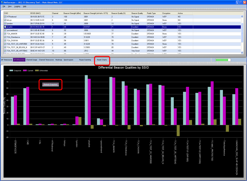
There are two ways to update the snapshot of beacon strengths that is compared against the current beacon strengths: by right-clicking the mouse button on top of the chart then a popup menu appears with a single choice -- 'Refresh Snapshot'. By selecting 'Refresh Snapshot' then the snapshot is updated. Alternatively, by pressing the 'Reset Charts' button located on the toolstrip in the middle of the display then all the charts are reset, including the snapshot used for this view.
Finally, by checking/unchecking BSSIDs in the grid (above) you can tailor this view to better focus on the access points you are most interested in monitoring.
Copyright © 2010, Nuts About Nets, LLC