Channel Spectrogram of the 802.11 b/g Channels
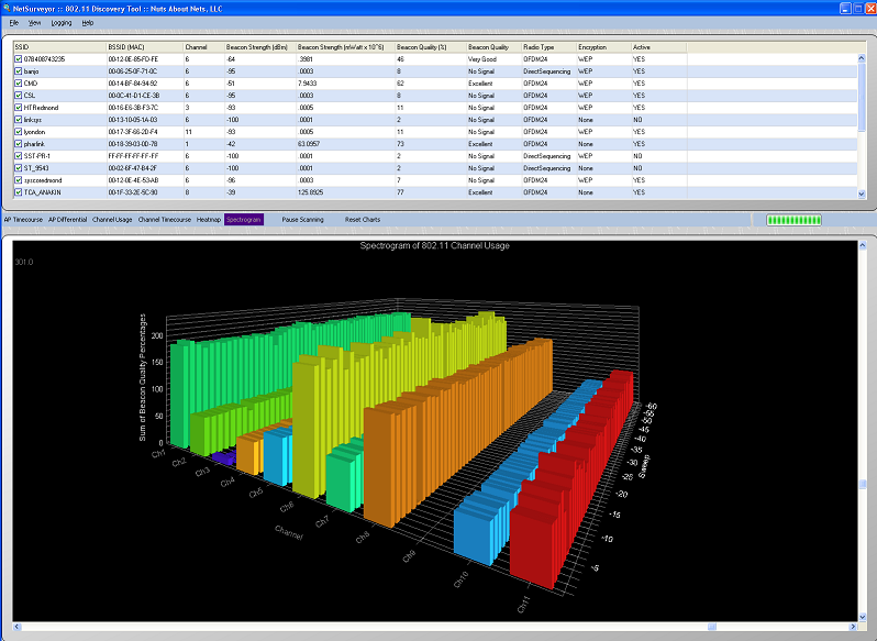
The Channel Spectrogram chart is a 3D view of channel usage as a function of time. Each channel is represented by its own set of bar graphs -- the X-axis is the channel, the Z-axis is a time scale, and the Y-axis reports the signal strength of beacons as a signal quality (0 - 100%). In this view the data for each channel represents a collection of access points -- hence the signal quality as displayed along the Y-axis is often greater than 100%. This is because we are summing the signal qualities for each of the access points that use a particular channel.
By checking/unchecking BSSIDs in the grid (above) you can tailor this view to better focus on the access points you are most interested in monitoring. 'Checked' access points are included in the summed beacon quality that is reported for a particular channel, whereas 'unchecked' access points are not.
Copyright © 2010, Nuts About Nets, LLC