Heatmap / Waterfall Chart of the 802.11 b/g Channels
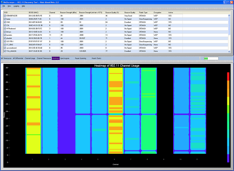
This chart combines the access points by channel and displays a summary of channel usage as a Heatmap. The Heatmap chart is also known as a "waterfall" graph. It is a 3-dimensional representation of the data, where the X-axis is the channel, the Y-axis is a time scale, and the "Z-axis" is the beacon signal quality that uses color scale. Each horizontal line in the Heatmap chart displays beacon signal strength (as a color) as a function of channel as measured over the time period of one scan. That is, with each scan (or sweep) a new row is added at the bottom of the Heatmap chart. The color legend to the right shows that stronger signals will appear red and weaker signals will appear blue.
By checking/unchecking BSSIDs in the grid (above) you can tailor this view to better focus on the access points you are most interested in monitoring. 'Checked' access points are included in the summed beacon quality that is reported for a particular channel, whereas 'unchecked' access points are not.
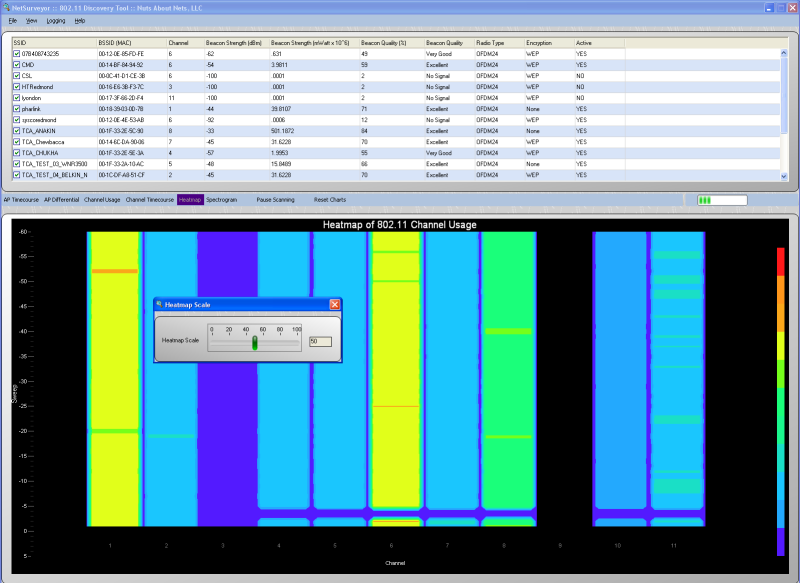
When right-clicking the mouse button on top of the chart then a popup menu appears with a single choice -- 'Rescale Heatmap...'. By selecting 'Rescale Heatmap...' then a small dialog box appears with a slider control. This control can be used to rescale beacon signal strengths to better spread them across the range of colors that are used. This is useful when beacon signal strengths are large and the Heatmap appears mostly red or when beacon signal strengths are low and the Heatmap appears mostly blue. Typically one would remap the color legend to better make use of the colors and how they are spread across the highs and lows of beacon signal strength values.
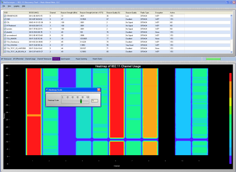
In the chart above we've rescaled the color legend so that channels 1, 6 and 8 clearly standout as being more heavily used than other channels.
Copyright © 2010, Nuts About Nets, LLC